Bane is a pretty one dimensional character in my opinion, and I am not a fan.
Although I do like seeing the different interpretations of the character across various DC related media.
This article is the first then in a visual series showing the comparative look at the art style and redesigns of Batman characters in the comics, and other mediums.
These articles are designed so that you can skip up and down the page to see the contrasting pictures, reading the comments is up to you. It it not intended to be comprehensive, I am not going to show every version of Bane, because that would be boring. I will choose whatever I find unique, interesting, or just damn cool art showcasing how Bane is interpreted in different mediums.

The Vengeance of Bane one-shot written by Chuck Dixon was the prelude to the Knightfall Saga. In the story we meet Bane first as a child born in a South American prison, who inexplicably remains in prison for life despite not committing any crime, and despite all good common sense.
Bane reads a bunch of stuff, works out some and decides to “break” Batman.
Batman whom Bane has never met or even seen a picture of, nor has any reason to hurt, nor any proof that Batman even exists. Bane just decides that he has to break the symbolic champion of Gotham.
Why not? I guess it beats sitting around in a cell all day. The cover here shows us his eventual costumed look, that of a mexican wrestler with the typical full face mask. Of course Bane is a lot taller and bigger than the typical Mexican wrestler, but the basic look is an obvious homage to a show wrestler, right down to the lace up boots and hunched over aggressive macho posture.
Of note here are the the long pants and shoes which Bane only appears to wear on this cover and not in subsequent stories. The footwear may be shoes or boots covered with the leg of the pants, it it not clear. The prominent tubing from Bane’s head to his arm tells us this is a significant aspect to the character by being highlighted in yellow.
The way Bane is looking out at the reader suggests some urgency to the character, he has beaten (and possibly killed) some men in uniform, and is eagerly looking to move to his next target, or get on with his quest / mission. He is clearly a man of action.

On this page we see the first full image of Bane in costume in a Batman comic. A previous page shows him without his mask in profile and partial views, putting on his outfit, (he has a rubbish hair cut) leading to this dramatic splash page that announces to the reader that Bane is here and he means business.
Here we can see Bane with mask, tubing from his head, wearing pants that look more like fabric, but could be leather, and a wrestler style open vest, that conveniently turns into a more traditional singlet depending on who the artist is.

The previous chapter in the Knightfall story ended with Bane breaking Batman’s back. Here at the beginning of the next chapter, Bane is standing on top of a building, boasting of his victory, then he throws Batman to the ground.
Batman should really be dead at this point, your life expectancy tends to go down when being thrown of off a building while unconscious with a broken back. Also, when I re-read this story now, it is impossible not to hear Tom Hardy’s Bane voice . Go ahead, read the speech bubbles in the following picture below and try NOT to hear Tom Hardy’s Bane voice in your mind when you read you read it.
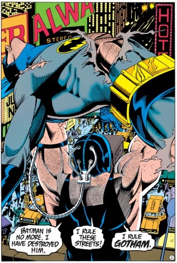
Re-reading the Knightfall story this year (in preparation for more blog posts, and to see the similarities to the film) I now can not hear anyone’s voice but Tom Hardy’s when I read Bane’s dialogue. Significant in this scene is the unobstucted rear view of of Bane’s mask and tubing, which is clearly connected to his his head, braced at the neck/upper shoulder region and connected to his wrist/forearm.

This art by prominent comic artist Kelley Jones became synonymous with the Knightfall / Bane saga. First used as the cover to Batman #497, and later used on the cover or insert to later trade paperback collections of the Knightfall storyline.
This image show Bane maxed out on the Venom drug, with a grotesque physique that is over exaggerated in every way for emphasis, and showing his total domination over Batman. It’s a great functional piece of art, in that it sells the book, and I want to know more about the story inside.
Kelley Jones is known for his moody Gothic style art, some people hate the extra long ears on Batman, I don’t mind them. My favourite work of his is the Batman Elseworlds Vampire Trilogy where Batman becomes a vampire, punches the undead in the face and kills Dracula to save Gotham.

Apart from being the critical moment, the money shot of when Bane breaks Batman’s back in Knightfall (the same scene would be pilfered and recreated in Christopher Nolan’s The Dark Knight Rises) this art is also notable for Bane having excessively hairy shoulders, which is typical of a man with high levels of testosterone. I guess he had time to stop and shave them between breaking Batman’s back in this scene, and then throwing Batman off a building soon afterward.
Jokes aside, this image is brilliant. You have the visual shock of a splash page, the look of pain on Batman’s face, the unusual jagged panel border sells the scene.

Here in Batman the Animated Series, Bane’s costume becomes a full wrestler outfit with pants that are likely tights, the one piece swimsuit style singlet, a prominent belt and of course his mask looks even more like a Mexican wrestler mask than his earlier incarnations in the various Batman comic books.
I think he looks a bit goofy here, but the look does the job for the show so I can’t complain. I mean does he want to hurt Batman or just pin him for a three count?

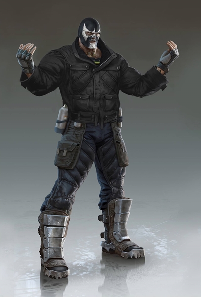
Chuck Dee drew a lot of fantastic character specific concept art that was used in the character designs for both Batman Arkham Asylum and Batman Arkham City. Of note here is the massive, almost Incredible Hulk like proportions of Bane, his arms and biceps drawn as thicker than his legs.
The image recalls the overly-exaggerated look of Bane from the earlier Kelley Jones Bane art, particularly the cover with Bane breaking Batman’s back. In this image, Bane is clearly Hulked out on the Venom drug, hence his over-exaggerated un-natural and grotesque physique.
The orange pants are a prison uniform, as are the shackles on his feet and wrists, which have been incorporated into his Venom delivery system for reasons unknown. Bane’s belt glows red, whether an artistic flourish or whether it has anything to do with the Venom delivery here is unknown.
Instead of one main tube connecting from his head to wrist here Bane has multiple tubes directly into his body, and a much larger module on his upper back which is no longer just a bracing point, but clearly has tubing connected to it, rather than just held in place. The straps seem to connect his back, making the overall Venom kit more like a backpack than the old tiny canisters in previous versions of Bane.
Bane wears a metal mask and collar, which are presumably part of his prison restraints.

Chuck Dee art here again, this picture of Bane is concept art for DC’s MMO. I don’t know what the final look was in the game as I’ve never played it. I downloaded the game on PS3, but it took like twenty minutes to even get the game booted so I just deleted it, but I think the concept art here is pretty cool. This design uses all the main Bane characteristics established in other incarnations.
Mask, mean looking, belt, wrestler singlet and pants, chunky belt and of course the Venom drug delivery tubing. Of note here is the spiky collar which gives Bane a slightly goth punk or fetish look in combination with the all black outfit and small silver studs on his wrist braces, belt and padded knee boots. But I have to wonder is Bane tuly angry, or are those pants just a bit too tight? This look seems to have been influenced by Bane’s look in The New Adventures of Batman and Robin.

Further conceptual designs for Bane in the Arkham Asylum series by Chuck Dee.
The side on view of the metal mask is very Hannibal Lecter, while the knuckle dusters just seem like overkill for a character who is already very strong. While menacing, something of Bane’s essential elements are lost without his traditional mask here, he could be just another Venom fueled goon.
The overtly fetishized costume, belts and mask to me suggest maniac or psycho, overall not a great look for Bane in my opinion. But the look can serve as the opening to a story, once Bane is back in more regular clothes, he would look much better. The great thing about concept art is that an artist can really cut loose and play around with different experimental elements before arriving at a final design.
I like all of Chuck Dee’s concept art for the Batman Arkham games, a fair amount oh his work was used in video game articles, online wallpapers and other promotional ways for the game series, such as the covers on the tie in comic books. His Joker art is to die for.

This image is a CG render of Bane as he looks in the first two Arkham Aslyum video games. You can see that the orange prison pants and the giant wrist straps have turned into restraints that also double as wrist gauntlets.
The neck collar / dog collar delivers electric shock to uncooperative prisoners in Arkham Asylum / Akrham City. The action figure of this version of Bane was a really nice toy [see below], and looks just the same as the CG render here. The Batman toy by contrast looks good, but the eyes (pupils) are really creepy.
I know because I have that same Batman toy on my desk here as I’m typing, and yeah the eyes just ruin an otherwise great action figure if you ask me. I’m going to put some white out on the eyeballs at some point, so he looks more like the white eyed creepy Batman, who is creepy in a good way, and not in a silicon valley way.

The follow up to the Rocksteady Arkham City video game was Arkham Origins, a prequel game that is set in the early years of Batman’s career. I played through all three games in the Arkham series multiple times, and this version of Bane was my favourite. You fight Bane twice in the game.
The first time he looks like this and later in the game you fight Bane again as the final boss fight, and he looks absolutely horrific maxed out on Venom. You fight Bane three times all up, as the second battle is in two parts, and the third time he goes insane as he overdoses on Venom and swells up to Incredible Hulk sized proportions.
In the first fight he runs away after the battle and jumps into a helicopter, then the Joker fires an RPG at the helicopter, a pretty awesome scene with plenty of explosions and just pure chaos courtesy of Mr J, who basically tries to murder the guy he hired to kill Batman just for fun. I wish joker had managed to kill Bane at the start of the game so I didn’t have to fight him again at the end of the game. Stupid Bane.

When you fight Bane again at the end of the game, he pumps himself up with drug of choice, the ever reliable Venom.
Overall I really like this look, Bane is big and muscly without looking freakish, and the boss battle while a little boring and predictable, is still good fun, unlike the third fight that follows, which made me Hulk out and turn into Al Swearengen from Deadwood. %$#%&^*$%$ing Bane!

After you beat Bane in the fight at the end of the game, he later overdoses on the Venom drug, and then basically Hulks out, going totally nuts. You can’t damage Bane directly in this fight, which means you have to make him do dumb things like run into walls, electrocute him, all the usual stuff really.
The final Bane boss fight is tedious and annoying, you die easily, while Bane takes a fair bit of damage to beat. If you stuff up some of the environmental cues (parts of the scenery you can use to damage Bane) then he becomes impossible to beat as there is no way to damage him, and you just have to start again. I enjoyed all the boss battles in Arkham Origins, except for this one.
 This is another CG render of Bane. This time from the Injustice: Gods Among Us fighting game. I recently got around to playing this game, and well, it is awful. One of the worst fighting games I have ever played, terrible controls, un-intuitive combat.
Some of the character renders look decent, this is not one of them. I think Bane looks awful in this game, and the art style I don’t care for at all. He look sto angular and spiky, and I don’t find him threatening at all.
The relatively rubbish spin off comic based on the story of the game (which has Batman fighting Superman) was more enjoyable then the game, but that is not saying much. I really wanted to like this game, but yeah it is rubbish in terms of game mechanics. Some nice Dragonball Z style knock back attacks and supers, but that is about it.
You can watch a Youtube video in a few minutes of the best animations, and then forget this game ever existed. Not even my cat like this game, and he normally loves everything with Batman. The mobile/tablet version of the game looks excellent, but gets boring after five minutes, and it takes forever to upgrade your characters, so steer clear of that one too.

I was never a fan of the gimp mask and spiky collar combo from The New Adventures of Batman and Robin. But like it or not, the look works, the art style works, and of course this one of my favourite versions of the animated Batman. I didn’t care for Batman’s redesign in the JLA cartoon, I think here in New Adventures he looks timeless and classic. At least this version of Bane looks mean and genuinely threatening.

This version of Bane is from Batman: The Brave and the Bold, a great show that is under appreciated in my opinion. Yeah, this version, it looks crap if you ask me. Did the animators go out to lunch and get the work experience boy to whip this one up? I mean Jesus, LOOK at him, what were they thinking? If they were aiming for the worst looking version of Bane, then they succeeded . I don’t know WHAT they were going for this design.
The basic elements and motifs are there, the mask, the green Venom cable tubing, the wrestler pants belt and singlet. But the face, and the overly rounded silly looking shoulders just make me want to laugh at Bane, rather than be afraid of him. The less said about this version the better. Let’s move on.

Wow! What is going on here. This redesign is from The Batman (another animated Batman show) and is the most dramatically different version of Bane so far. It is weird looking. I don’t know if the red parts are meant to be a costume or he has read skin?
Overall I like that something different was attempted here, but I don’t think the look really works. He looks a bit like Red Hulk after a night out in a fetish club. I don’t love it, or hate it, but it is an interesting redesign. The Batman show also gave the Joker a dreadlocked Rastafarian look, that show really changed up the look of the villains with some bizarre choices.
So this strange looking Bane is not that strange when you look at him in context with the other characters on the show, who are basically all weird looking. I give them credit for mixing things up. But weird for the sake of it does not equal good in my book.

Now this is more like it. This version is from JLA: DOOM, a pretty bland direct market animated feature. Bane looks like a bad-ass. Don’t mess with this guy!
Except… wait a minute, did he accidentally burn a hole in his clothes?
Why is there a giant Superman diamond shaped hole on the front of his one piece? Overall, I love this look, but the open chest piece looks ridiculous. Either cover it up or put him a proper singlet, not this bastardised piece of clothing.
I’m starting to sound like a real misery guts here, and I gotta tell ya, it’s going to get worse before it gets better.
 Bane from the Young Justice animated show (a great show, well the first season is brilliant, second season not so much).
Another good look. Stripped back, no spiky collar or silly straps and junk all over him. Just lean and mean.
Mask? Check. Venom cable (in fashionable red) and the classic prison tough guy singlet. This is Bane before he hulks out on Venom of course, so he looks a bit skinny, but that is just the art style of the show, and for me it works. i like than in the show he appear to be genuinely Mexican, rather than speaking with an accent and basically being white. That always bugged me.
I can’t stand when characters of various non-caucasian races are anglicised for comics, or because they ran out of ink at the printers again. Yeah, sorry old man whitey at the printer, that excuse may have held up in the forties, but don’t be pulling that shit now!

Sweet Jesus what were they drinking the day they came up with this one and where can I get some?
This is (sadly) the most camp version of Bane from the Batman and Robin live action movie. In the film Bane just grunts and mumbles, and doesn’t talk. He is a mindless henchman to Poison Ivy. His skin is so green and scaly you could almost mistake him for Killer Croc. The spikes on the belt are just silly, not scary. The prominent crotch is offensive.
Batman 66 did camp on purpose, and the villains in that show still look great today. Cesare Romero’s Joker, Julie Newmar’s Catwoman, Frank Gorshin’s Riddler. Love or hate the show, the costumes worked in context, and the villains really popped on screen with their vibrant gaudy colours. The show looked like a comic book.
In contrast, Bane in Batman and Robin looks like the drawing of some ten year old kid who had never seen Bane, and based his drawing based on a description his mate told him of what Bane looked like. Nothing about the costume, the overall look or the style works here in my view. Utter rubbish.
This version of Bane was played by Robert ‘Jeep’ Swenson, a pro wrestler who sadly died in the same year Batman and Robin came out in 1997. His physique was impressive, imagine what he could have been like in a modern comic book movie instead of the lousy Batman and Robin. He will be missed.
 An issue of the Secret Six comic book. Secret Six is another book that takes a bunch of DC super villains and puts them into a ad hoc team, similar to the Suicide Squad. The results are mixed, some issues are great fun, others are pretty bland.
Depends on who is writer is really. The cover is pretty cool. Bane’s mask reminds me of Spawn, or Venom, take your pick. This cover may even be a homage to Spawn? I don’t know, stranger things have happened.

This little fella is rather cute. Bane from the Lego Batman video games of course. His Venomised version basically looks like Hulk from Lego Marvel but with a a different skin.

I didn’t need to include this one, the costume is classic Bane and unremarkable. I only included this image because I love seeing Bane doing a face plant after getting shield slapped by the good Captain. Eat pavement idiot!
Every artist has the right to express their unique version of a character. How boring would it be if Batman and his rogues gallery still looked exactly the same as they did in the fifties? Pretty boring. I love artistic diversity. I don’t love Bane, but it has been fun looking at some of the different artistic interpretations of one of my least liked Batman bad guys.
I hope you enjoyed seeing the visual comparisons too, and didn’t mind my criticisms too much.
Soon I’ll be doing visual comparisons of the different looks of other Batman characters, and eventually Batman himself, along with the Joker.
If I had to pick a favourite version of Bane, I would go with the less pumped up look from the Arkham Origins game. That was the first time I felt that I enjoyed Bane as a character, other than of course the cinematic version that I like – in my view the definitive Bane – Tom Hardy’s Bane in Dark Knight Rises.

At first I did not care for this version of Bane but after watching the film multiple times, this look has really grown on me to the point where I like it. Except for the part where the mask does basically nothing, and is attached to nothing, that still really bugs me.
I had a words or two to say about Tom Hardy’s Bane, so check out that article if you missed it. Mostly I ramble on about how rubbish the fights were in Rises, but there is some other stuff in there too, so take a look.
No Pain No BANE – Tom ‘Hardman’ Hardy
Do you love or hate Bane? Do you like the comic book, animated, video game or movie version best? I’d like to hear from you, so leave some comments people!

1 thought on “State of the Art – BANE on the Brain”